Following on from last week's post on converting the Windy City Wizard, we are now ready to begin painting. This is a process (or, if you count the banner, several processes) that I've been meaning to document here for quite some time, as it's handy to be able to refer people here when they ask me about my paintjobs. I have to warn you, though, it's a little long.
At the end of the last section, we had the figure undercoated in mid gray, ready for the process of under shading. At this point, I give the whole model a generous wash of diluted Windsor and Newton black ink.

As ever with washes, you want to avoid pooling--but in this case the risk is not that great since there will be a lot of drybrush layers on top of it. Furthermore, the W&N inks are really good about sinking into the recesses. If you are using diluted black acrylic instead, I recommend adding a few generous dollops of matte medium to get a similar effect.

Once the wash is completely dry, go back with an overbrush of the mid gray basecoat (this, for reference, is 1:1 white to black. Some people like to add blue to this mix...I've never tried that, but intend to...someday.) You can see the result above.
At this point, I do something slightly...unorthodox (but only slightly). I've been developing a technique for painting surfaces decorated with starfields--a sort of mystical/magical look. In this case, I want the wizard's robe to be a kind of fay garment, a textile woven of the deepest regions of the cosmos. So I take an old toothbrush and dab it in some white paint, then flick it gently over my paper towel until all the larger gobs have flown off. Then I go on to flick the brush over the empty areas of robe.
If you're doing just a normal undershaded figure, simply skip this step.

The rest is all drybrushing. As I progress to lighter and lighter shades, I try and make the highlight more and more zenithal. Holding the miniature so that you are looking at it from the top down helps, as if your eye were the light source. The areas you can see should be the lightest. Also, be sure to avoid obliterating the starfields, if using.

The model is drybrushed with 2:1 white to black...

...followed by 4:1...

...then 8:1, and finally a dusting of pure white.

At this point, all of the edges and details are clearly defined, which makes the painting process even easier.

While I was waiting for the wash to dry (that part takes a while) I went back to the banner. I had let the waterproof ink (I use noodlers bulletproof black) dry overnight to avoid any streaking. Now I go over the whole banner very gently with an eraser to remove the pencil undersketch.

I went Windsor & Newton again for the colors here. I'ts hard to beat them for vibrancy (though I've heard that liquitex have similar properties, are available in single colors, and are less expensive, so I'll definitely be giving them a try at some point as well.)

I wanted to keep the color palat relatively simple, so for the hat, beard and face, I used the same mixture of Peat Brown and Deep Red inks (approximately 1:2) diluted to various opacities with water. The lettering and the wizard's eyes were done with Vermillion straight from the pot.

I went with Blue for the background of the flag and for the windy speach bubble, completing the hommage to the flag for the city of Chicago (and the colors of CSW) The motto ribbon and middle stripe were done in a dilute mixture of Canary Yellow and Peat Brown to give an aged look to the relatively white spaces.

Don't want things looking too clean though, so I took my trusty old toothbrush and flicked that same yellow brown mixture over the front of the banner...

...and then the rest of the yellow-brown and the red-brown mixtures generously all over the backs.

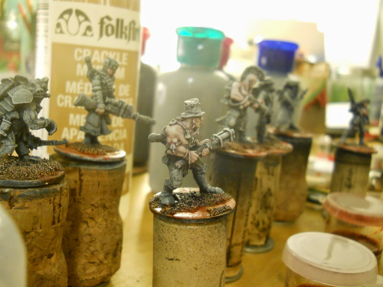
While that was drying, I went on to the painting stages for the figure. Prior to starting out, I had already treated the banner pole to some Rub n' Buff ersatz gold leaf. Next up is the skin (this needs to be done separately and in the traditional fashion because the drybrush highlights do not make for convinciing flesh.)

Now comes the fun part: glazing! For this step you use thinned out inks or paints to apply a color to an area while allowing the dry-brushed highlights to show through. W&N inks thinned with water are great for this, or can be used straight from the bottle for more intense colors. Acrylics thinned with matte medium also work very well and are a little easier to control, though are not quite as vibrant. Above, you can see I glazed the red areas, since they happened to be the same color as the wash I used for the skin.

Here you can see the exposed skin highlights are done and the eyes are a nice, menacing, spell-castery red.

From here, you move from color to color and spot to spot on the mini. The process is rather like applying a wash, except with less paint in the brush. I like to load my brush with glaze, then touch it to a paper towel a couple of times to make sure there's no excess. When you touch brush to surface, you want to deposit a thin even coat of translucent color, rather than a pool.

You may find some areas (like the skull or the book pages above) that don't quite glaze up nicely. This tends to be lighter colors. These are easy to tackle with traditional highlights. Sometimes it's as simple as mixing your glazing color with a bit of acryllic and using that to enhance the under-shaded highlights.

On this figure, I worked more or less on a whim, selecting the colors for the familiar, the feather, the stack of books on the fly. The base got a greeny-brown wash to suggest damp stone.

The one thing I had planned out was the robe. I wanted it to be a rich and vibrant blue, so I used Ultramarine straight from the jar all over the robe.

Now, here's the thing about W&N inks: they bleed. Their website might say that they're water-resistant, and maybe they are...on paper, after some time. But when you've just put the ink to the figure, it will come loose again if you put more glaze on top or next to it.

You can use this to your advantage. I used it to blend purple ink into the blue at the edge of the robe, the ends of the sleeves, and the tip of the hat. Basically, it's like wet-blending except you don't need two brushes and you don't need to worry about drying time.
It's like magic.
Perfect technique to suggest illimitable nebulae in the depths of a wizard's robe.

Here are the finished pictures.


I have to say that if I were to do it again, I might lighten up on the Ultramarine a little bit. It's a very intense color and might obscure the stars a little too much. In all, the effect needs some further development.

Well, that was exhausting. Thanks for sticking with me through such a long post. Let me know what you think in the comments...

...I COMMAND YOU.